Project Borderless
One event, every side. Neutral coverage of US politics.
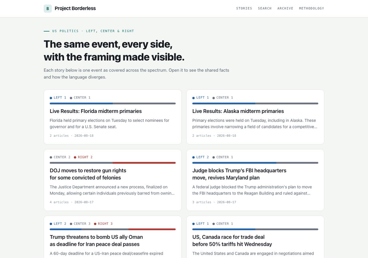
See it in action
Every lean label and every step of the framing analysis is explained on one page, including exactly where the labels come from and the outlets currently in the feed. It's the clearest way to see whether the neutrality claim actually holds up.
Read the methodology ↗ (opens in a new tab)The problem
Every big story gets told differently depending on who is covering it. Figuring out what actually happened, versus how it is being spun, means reading five outlets and coming away exhausted, or picking one outlet and trusting it more than you should, and just picking a side ends up being the path of least resistance for most people.
Why I built it
I wanted to read the news without picking a side: the facts everyone agrees on in one place, and the loaded language each side uses made obvious instead of invisible.
The mechanism is deliberately narrow. The site pulls headlines and short excerpts from outlet RSS feeds, never full articles, turns each one into a numeric embedding, and groups items about the same event into a story when they fall within a rolling time window. A story only reaches the feed once it spans at least two sides of the spectrum, so a one-sided item never shows up dressed as balanced coverage.
The line I'm most careful about is where the lean labels come from. Each outlet's left, center, or right label is pulled from published, independent media-bias research, AllSides and Ad Fontes Media, not my own read of the outlet. Reasonable people can disagree with any single rating, so the site cites the source for every one, on purpose, so you can go check it yourself instead of taking my word for it.
For each multi-side story, an AI reads the collected headlines and excerpts and produces the shared facts every side reports, a short note on how each side's language differs, and the specific loaded terms each side used. That analysis is clearly labeled as AI-generated and can be wrong, it's built to be a reading aid, not a verdict, and every headline links back to the original outlet so you're never reading my summary instead of the source.
The site is deliberately restrained about what it stores, too. It keeps a headline, a short excerpt, and a link back, never the full article, so it's pointing you at real journalism rather than replacing it. If a publisher ever wants something taken down, that's a direct email away, not a fight.
What it does
- Clusters coverage of a single event from left, center, and right outlets, with each outlet's lean labeled from published methodologies (AllSides, Ad Fontes), not my opinion.
- Separates the shared facts everyone reports from how each side frames them, with the specific loaded language each side uses called out.
- Draws from named, real outlets across the spectrum, from The Guardian and Mother Jones on the left to NPR and the BBC in the center to National Review and The Dispatch on the right.
- A daily email digest and a full, searchable archive.
Where it's going
The clustering and labeling run on their own now. What's left is the trust-eroding small stuff, like a guessable methodology URL that currently 404s instead of showing the page that explains how any of this works, the kind of detail that matters most on a site whose entire pitch is that it can be checked.
Could this work for you?
The real value here is the pattern, not the topic, and it travels. A few ways the same idea could work for something of yours:
Any polarized topic
The same side-by-side treatment for a divisive issue in your field or community.
Media monitoring
Show a team how a story, or a competitor, is being framed across different sources.
Any compare-the-sources tool
Anywhere the value is neutrality and making bias visible.
Want a version of this for your own idea? That's a great first conversation.
Let's talk